The SEED Adult & Family Learning Community
Redesigning For Community Outreach
This project took place during Austin Give Camp, a 3-day hackathon where members of the Austin tech community partner with nonprofit organizations to help revamp their websites. Our team was in charge of helping a nonprofit ESL learning community organization, The SEED in improving their website for better outreach and visibility.
My Role On The Team
Within the team I was in charge of the following:
- Conducting The Usability Tests
- Designing The Persona
- Redesigning The Site Flow
Background
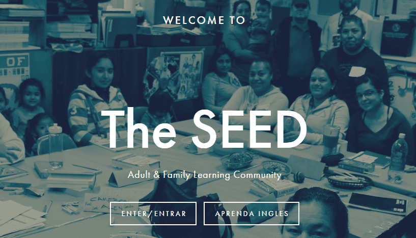
The SEED is a nonprofit organization committed to helping the Spanish-Speaking community of Austin get well adjusted to the city by providing ESL classes in a safe and welcoming atmosphere. The organization has been looking for ways to expand and gain visibility on the web in order to gain more volunteers to teach ESL classes as well as donors to help supply the necessary funds for classroom materials such as computers, printers, etc.
Goals
- Make it easier for the users to understand their story better
- Make it easier for the users to sign up and volunteer to teach ESL classes
- Make it easier for users to donate through the website
Evaluative Research
Usability Testing Round 1 - Original State Of The Website
One of the first steps to revamping the website was to examine the usability of the original state. I had three research questions in regards to the usability of the website:
- Are users able to locate page(s) that contain how to get involved?
- Do the users feel comfortable making donations through the site?
- Do the users feel motivated to support the cause?
- Examine the homepage and describe what they notice
- Find a way to sign up to volunteer
- Find a way to make a donation
Discoveries Made During Usability Testing
We discovered three major issues the users were facing during these set of tasks.
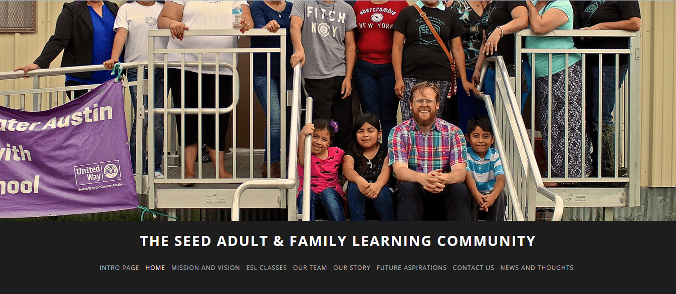
Overall, the website was suffering from issues with information architecture. There was a lack of a consistent flow that tells the organization's story and allows the user to want to support the cause.
- Navigation Bar Slowed Decision Making - The long navigation bar at first glance made the users feel paralyzed and confused on where to click.
- Lack Of Proper Chunking Within Each Page - The users felt very fatigued having to scroll through several long paragraphs just to find the information they were looking for.
- Mismatched Labeling Of Pages - The users had trouble searching for volunteer opportunities because the labels on the navigation menu didn't match their mental associations with volunteer work, resulting in giving up out of frustration.
- Inconsistency With Donation Button Placement - The users were confused by why the donation button was nestled at the very bottom of each page.
- Lack Of Context For Purpose Of Donation - All the pages simply had no mention of what the purpose of donations were for, making the users feel uncomfortable attempting to make a donation.
Overall, the website was suffering from issues with information architecture. There was a lack of a consistent flow that tells the organization's story and allows the user to want to support the cause.
Thinking In The Users Shoes
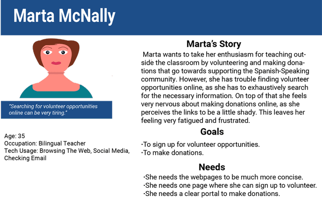
Based off of our findings during usability testing, the next step was to communicate those findings to the UI Designer and Developers of the team. To make it easier, I made a persona modeled after the two users we tested.
Persona Of Marta The Bilingual Teacher
With Marta's perspective in mind, we worked together to brainstorm how to restructure the website such that it was easy to follow, motivated her to contribute to the organization, and was easy for her to perform such actions.
Restructuring The Website
Redesigning The Flow
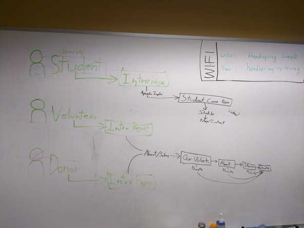
There were some constraints we had to keep in mind when restructuring the website. The website was designed to be bilingual so that the Spanish Speaking users could be able to sign up for English classes. We started sketching out how the new structure should flow on the whiteboard with the goal of making the navigation simpler while maintaining the bilingual nature.
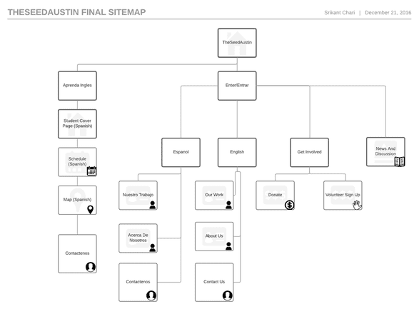
Finally, we settled on a solution where the website starts by asking the user to select their respective language, followed by a navigation bar with four options: Espanol, English, Get Involved, and News And Discussion. We hypothesized that users like Marta tend to associate "Get Involved" with actions such as signing up to volunteer as well as making donations, hence why we consolidated them into one page. We also used the principle of progressive disclosure within the English About Us pages to make the users feel intrigued and want to learn more about the organization.
Results From Redesign
Usability Testing Round 2 - Testing The Update
With the website finally updated, it was time to test out the website again to see if the users benefited from the changes. We managed to test two users again with similar procedure as the first set of usability tests.
We received the following feedback:
All these were positive signs that we were heading the right direction with our update.
We received the following feedback:
- Navigation Bar - Much more self-explanatory than before
- Get Involved Page - The page made it much quicker for users to donate and sign up to volunteer
- Storytelling Of The Pages - The users felt that the images and shorter paragraphs were much more persuasive
All these were positive signs that we were heading the right direction with our update.
Testimonial From The Executive Director Of The SEED
"Srikant was a key member of The SEED's team, providing great insight and skill throughout the weekend-long process. In the end, his work contributed to a rebuild of our website, including building pathways for specific visitors and creating a more personalized donation protocol, which has already shown to increase private donations."
-Cameron Allen, Executive Director, The Seed
-Cameron Allen, Executive Director, The Seed
Reflections
This project was really significant in many ways. First, it taught me that revamping a site isn't simply a matter of stripping away information, but rather working with the complexity and figuring out ways to make the complexity make sense so that it doesn't overwhelm the users. Second, it allowed me the opportunity to practice my skills as a proctor for usability testing. Usability testing proved to be very vital in our redesign as it helped us understand the pain points on the original site and helped us set clear goals on what to focus on to make the experience better for the users.
Acknowledgements: This project took place during Austin GiveCamp under supervision of Cameron Allen. This project was in collaboration with Kendall Jordan, Joe Wooten, Tracy Holmes, and Cherie Tabb. Special thanks to all the members of the team.

