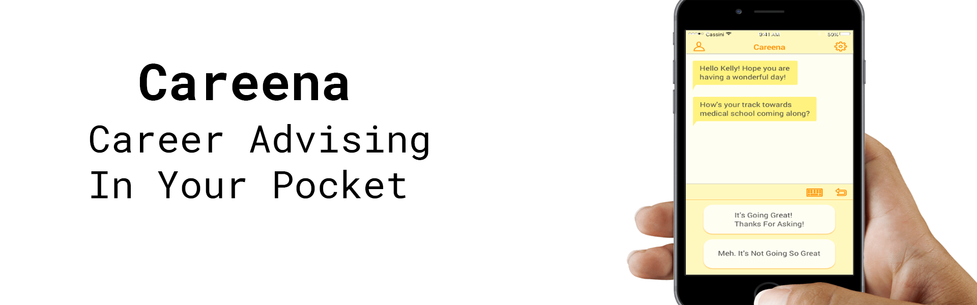
Careena is a career guidance chatbot our team designed with the purpose of providing career advice and suggestions for first year pre-med students. We applied user research, affinity mapping, conversation mapping, and prototyping for this project.
My Role On The Team
As the UX Researcher and Information Architect on the team, my responsibilities were as follows:
- Conducted secondary research on the psychology of career decision making
- Conducted secondary research on pre med statistics
- Conducted user interviews
- Facilitated the affinity mapping session
- Created conversation maps for the interactive prototype
- Content strategy for Careena
- Proctored two usability tests
Problem
Career Choice Anxiety
Making the right career choice can be a source of anxiety for a lot college students early on. A common theme we found within the research papers on the psychology of career decision making was that career indecisiveness was linked by three factors: low self-confidence, high anxiety, and the dependency of others.
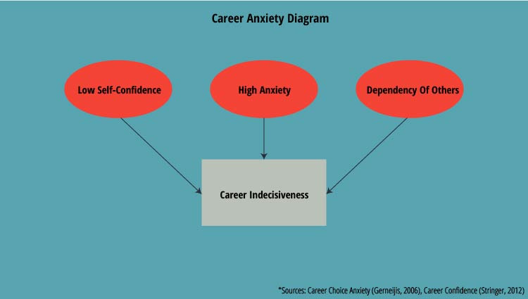
Flowchart illustrates the factors that lead to career indecisiveness
Pre-Med Career Track
This is especially the case for many first year students who are on the pre-med track with intentions of going to medical school and becoming a doctor. The data below suggests that the track to getting into medical school is one that is very rigorous and competitive with no guarantee of getting accepted the first time around.
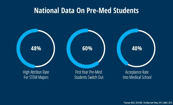
Data on attrition rate and acceptance rate
Design Challenge
- How can we help mitigate the pains of career decision making for first year pre-med students?
Research Process
Discovery Interviews - Freshman Pre-Med Students
Once we had a general understanding of the scope of the problem, our first step was conducting discovery interviews with the freshman pre-med students. The reason behind conducting the user interviews was so that we could capture the behavioral nuances and sentiments for their motives behind pursuing the Pre-Med track.
Our big research questions for the freshman pre-med students were as follows:
Using these big research questions as a guide, we designed specific questions centered around such factors. The recruitment and interview process was as follows:
Our big research questions for the freshman pre-med students were as follows:
- What was your motivation for going the pre-med route?
- What are you currently doing to help with your pre-med trajectory?
- Whom do you consult for pre-med career advice?
- What kind of answers do you hope you to obtain?
Using these big research questions as a guide, we designed specific questions centered around such factors. The recruitment and interview process was as follows:
- Recruitment via Facebook University Pre-Health Groups and Freshman Class Groups.
- Recruited 6 participants for the interviews.
- Interviews took place over 1 1/2 week period during specified times.
Insights Uncovered During Synthesis
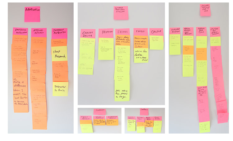
Insights collected and organized during the affinity mapping session
After we finished the interviews, we held an affinity mapping session to uncover insights from the raw qualitative data. As a result of the affinity mapping session, two personas began to emerge, helping us illustrate their stories better.
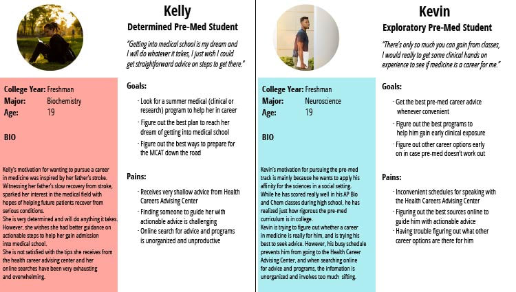
Two of our personas: Kelly and Kevin
While there were differences in motivation for pursuing the pre-med track between Kelly and Kevin, there were some common patterns in what they expected out of the advice received as follows:
- The advice must provide depth
- The advice must be direct and actionable
- The advice must be easy to follow through
Design Process
Design Decision - Conversational UI
The current situation for seeking out advice involved going through multiple websites and talking to multiple people. This process was very exhausting for Kelly and Kevin who wanted absolute, straightforward answers to reaching their goals.
That's when we thought:
That's when we thought:
- "What if Kelly and Kevin were able to consult just one person with all the best advice they needed, whenever convenient?"
Designing The Content And Conversational Flow
Due to the scope of the project, we decided it was best to focus on one scenario for the final final prototype. We decided to focus our tips around convincing Kevin and Kelly to consider shadowing for a clinic during their first summer.
The biggest challenge was designing how the user would proceed through the conversations. To work around the limitations of AI, we designed a choice architecture that was akin to text-based adventure games, where the user would select an option within the conversation to proceed through a path.
We had some rules when designing the layout of the content as follows:
We had some rules when designing the layout of the content as follows:
- There should be no more than 140 characters per chat bubble
- There should be between 1-3 choices for the user to proceed
- There should be no more than three chat bubbles for Careena
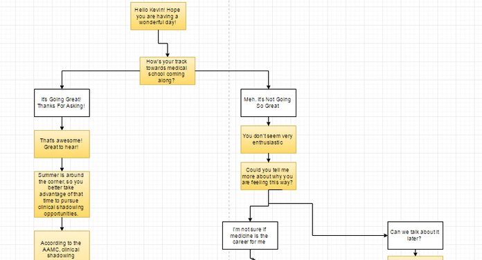
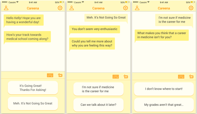
Sample of the conversation map of Careena
Sketching Process
Working closely with our UX/UI Designer on the team, we iterated on the layout of the interface for Careena. Taking inspiration from other messenger apps and chatbot interfaces.
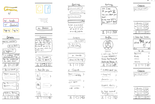
Early sketches by Derek Han
When it was time to start creating the final version of the prototype with the scenario, to make it easier for my teammate, I created a sample sketch to illustrate how the interaction would work for guidance.
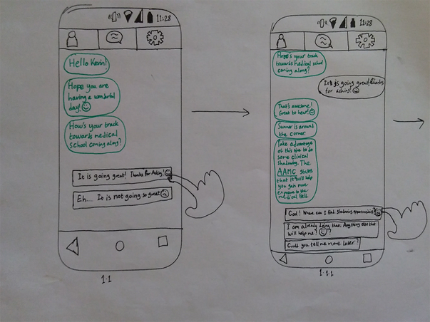
Sample sketch of the interaction design for Careena
Final Visual Design Of The App
When it came to the visual design of the app, we wanted a color palette that primed users to feel optimistic and hopeful about their future. Our visual designer, experimented with various color palettes, but in the end we decided on a yellow and white color scheme was the best for the UI. Yellow is a color that represents optimism and hope which naturally fit with the app's tone in assisting user's with career guidance.
Final visual design of the app by Derek Han
Usability Testing
Usability Testing Procedure
We decided to conduct some usability tests to see if we were heading towards the right track with our design decisions. We tested the following:
Due to the scope of the project, we only managed to conduct two usability tests. However, in spite of the small sample size, we were provided with great feedback in regards to the app's flow and functionality.
- How the colors made the users feel?
- Were they able to navigate through the chatbot scenarios?
Due to the scope of the project, we only managed to conduct two usability tests. However, in spite of the small sample size, we were provided with great feedback in regards to the app's flow and functionality.
Usability Testing Feedback
Positive Feedback:
Areas To Improve:
- Color Scheme - Users felt welcomed by the yellow color scheme
- Conversational Flow - Users felt a sense of direction that they were going to get something out of it
- Overall Structure - Users felt less overwhelmed when navigating through the app in contrast to searching online
Areas To Improve:
- Choice Architecture With One Option - Users felt confused with only one option
- Lack Of Personality - The users felt that conversations were lacking in personality
Reflections
While the app's flow and functionality was well received thus far, there is still more to explore. In the future, we're hoping to experiment with the following:
- 3-4 Options In Choice Architecture - To examine the limits user's would have in deciding which path to explore
- Adding Personality With Emojis - Explore the use of emoticons to see if it adds any impact to the conversations
- Adding The Gamification Element - Explore the concept of gamification to see if it makes an impact on motivation
Acknowledgments: This project was conducted at The University of Texas at Dallas under faculty guidance by Cassini Nazir. This project was in collaboration with Derek Han and Yan Su. Visual UI Designs by Derek Han and photographs from interview by Yan Su.